The best insurance websites do one thing well: they make a worried or curious visitor feel safe enough to ask for a quote. Nobody enjoys shopping for cover, so the site has to remove doubt in the first few seconds and then make the next step obvious.
This guide looks at what the best insurance websites have in common, gives you 10 design ideas you can apply to your own agency, brokerage or carrier site, and shows how to build it faster with a ready-made template. It is written for agencies and brokers, and it does not name or copy any other company.
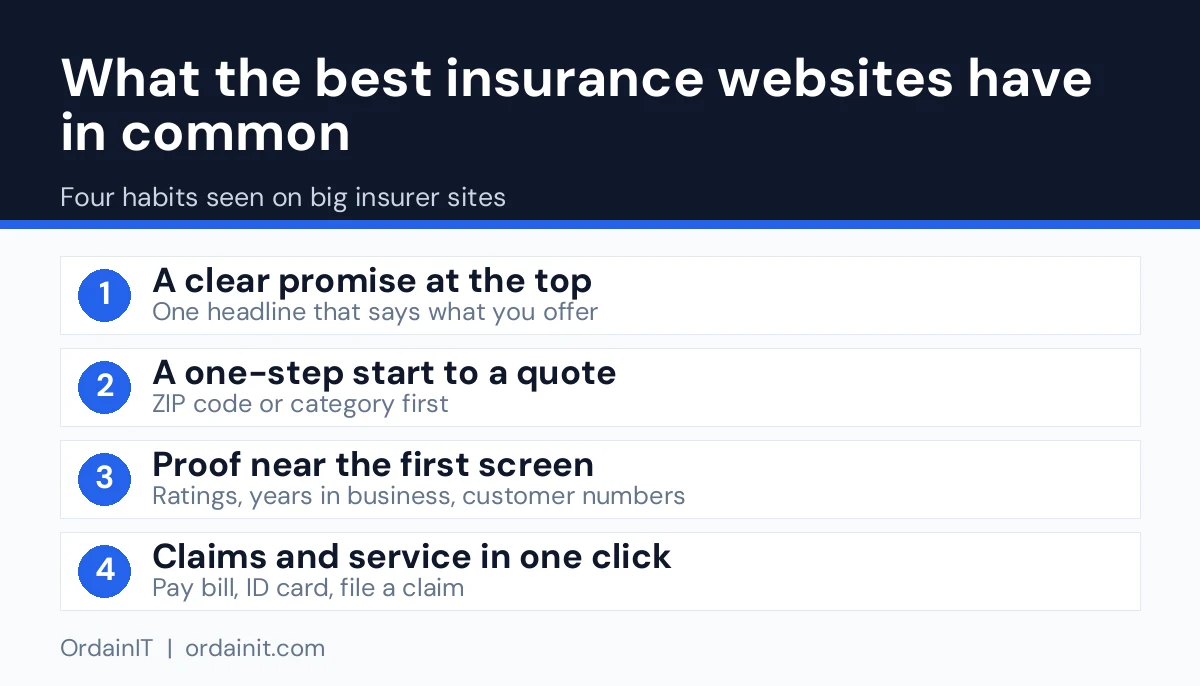
Insurance is a trust purchase. The visitor cannot touch the product, so they judge you by how the site looks and behaves. The best insurance websites share four qualities: a clear promise, fast pages, proof that real people stand behind the business, and one obvious action on every screen.
Google says in its own SEO Starter Guide that helpful, people-first content and a clear site structure make it easier for both users and search engines to understand a site. For insurance, that means plain language about cover, simple navigation by product, and pages built around the questions customers really ask.
Design is not decoration here. A calm layout, readable type and honest wording lower the visitor’s stress, and that is what turns a search into a phone call or a quote request.
These are six large insurance sites that are often cited as strong examples. We opened each homepage on 14 November 2026 and describe only what we saw. They are examples for learning, not endorsements, and a national carrier has far more resources than a local agency, so copy the ideas rather than the scale.
The headline reads Forget everything you know about insurance, and the main button says Check our Prices. The menu is a short list of products: renters, homeowners, car, pet and life. The page shows a 4.9-star App Store rating, A-rated status and B-Corp certification, and each product card shows a starting monthly price. Lesson: a clear starting price lowers the barrier to a quote. Visit Lemonade.
The headline is Coverage That Grows With You, with a Build My Bundle button. The quote starts by choosing a category, such as vehicle, property, personal or commercial, then a specific product. The top menu keeps Claims Center and Resource Center in view. Lesson: sorting visitors by need first keeps a long product list simple. Visit GEICO.
The first thing a visitor sees is a quote module for auto insurance with a ZIP code field, plus links to continue a previous quote or find an agent. The menu has four tabs: insurance, claims, resources and about us. The page also shows trust facts such as trusted since 1937 and 24/7/365 support. Lesson: a one-field start makes the first step easy. Visit Progressive.
The homepage pairs a ZIP code field with a Start a quote button and a separate Find an agent field. It offers no-login actions such as paying a bill, getting an ID card or filing a claim. It cites operating since 1922 and a 4.8 out of 5 App Store rating. Lesson: serve existing customers as well as new ones, and make the agent easy to find. Visit State Farm.
The headline is Find the right commercial insurance for your business, with a Select all that apply questionnaire that recommends products. Products are shown as a grid of cards with a one-line description each. It cites a 4.7 out of 5 Feefo rating and a phone line staffed by licensed agents. Lesson: a short questionnaire guides business buyers who do not know what cover they need. Visit Hiscox.
The headline is We protect more of your life, with a Start your quote button and secondary links to find a local agent. The menu groups products into vehicle, property, personal, business and investments, and a no-login panel offers bill payment and claims. Lesson: group products by audience and keep service tasks one click away. Visit Nationwide.
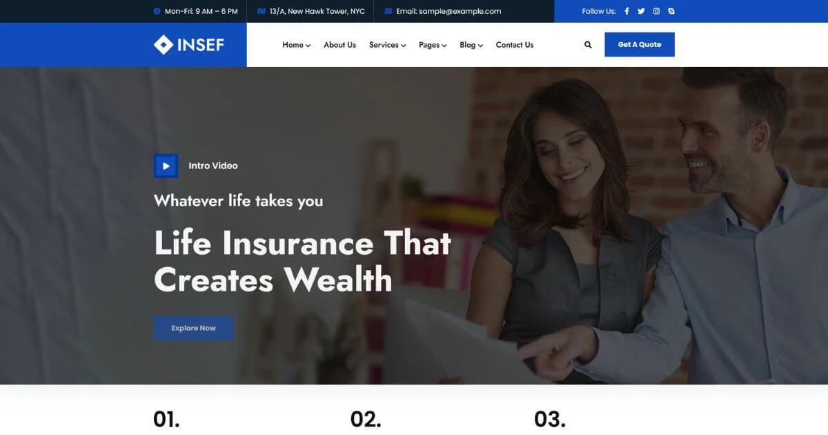
All six lead with a clear promise, give a one-step start to a quote, show proof such as ratings or years in business, and keep claims and service tasks easy to find. A local agency can use the same approach at a smaller scale with a template such as Insef or the free Safely.
You do not need a large budget to use these ideas. Each one is a layout or content choice that you can add to a template in an afternoon.
Say who you help and with what, for example car, health, life or business cover for families and small firms. Vague slogans make visitors leave, while a specific line tells them they are in the right place.
Pick one action, such as Get a Quote or Talk to an Agent, and repeat it in the header and hero. Too many equal buttons split attention and lower enquiries.
Ask only for what you need to start the conversation: name, phone or email, and type of cover. You can collect details later by phone. Long forms are the most common reason visitors give up.
Give car, home, health, life and business insurance their own card with a one-line benefit and a link to a detail page. This also gives search engines a clear page for each product.
Show licences, years in business, partner insurers and genuine client reviews near the first form. Only use claims that you can prove, because inflated badges damage trust and can break advertising rules.
Photos of the people who answer the phone feel far more reliable than stock images. Add a name, role and short bio to each team member page.
Answer questions about excess, renewals, claims and cancellation in simple words. A good FAQ cuts support calls and can win rich results in search.
Explain in three or four steps what happens after someone files a claim. People compare insurers on how they behave when something goes wrong, so this page sells.
Many visitors will look at cover options on a phone, often while comparing several providers. Large tap targets, a sticky call button and fast loading matter more than animation. Google’s web vitals guidance explains the speed and stability measures to aim for.
A blog or guide section that explains cover types brings in visitors who are not ready to buy yet. Link every guide to the matching product page so interest turns into a quote request.
Building from a blank page takes weeks and usually repeats these same decisions. A purpose-built template gives you the layouts already tested for this industry, so you only add your own wording, photos and licence details.
OrdainIT designs and sells its own insurance templates. Insef is an insurance HTML template built with HTML5, CSS3 and Bootstrap 5, with 3+ home page layouts and 16 HTML pages covering services, portfolio, testimonials and contact. It suits agencies, brokers and car, health, life and business insurance providers.
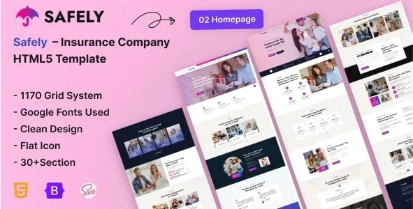
If you want to test the idea first, Safely is a free insurance template in HTML5 with 2 home pages and 15 pages in total, including plans, pricing, team, FAQ, blog and a contact page with a working AJAX form. The form needs PHP hosting to send mail.
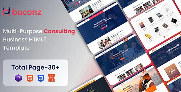
If your firm sells advice as well as policies, Buconz is a corporate template with 6+ home pages and 29+ inner pages for financial and insurance consultants. You can also read our guides on the insurance agent website, insurance web design and insurance broker website for more detail on each audience.
Most weak insurance sites fail for simple reasons rather than technical ones. Check your own site against this list.
Before you publish, confirm that every product has its own page, that the quote form sends mail to the right person, and that the site works on a phone. Add a privacy policy and cookie notice that match your local rules, and set up Google Search Console so you can see which searches bring visitors in. If you would rather hand the technical setup to someone else, OrdainIT offers fixed-price WordPress services below.
Before you design anything, spend an hour reviewing five insurance sites in your market, including direct competitors and a few from other regions. Open each one on a phone first, then on a desktop. Note how quickly you understood what they sell, how many clicks it took to reach a quote form and whether the contact details were easy to find.
Score each site from one to five on clarity, trust, speed, mobile use and the strength of its main call to action. Write down one idea you like and one problem you notice on each site. After five reviews, patterns appear: the strongest pages explain cover in plain words, show proof early and keep the path to a quote short.
Use these notes as a brief for your own layout rather than copying anyone. Your licence details, team and local knowledge are what make your site different, so build the design around them. This simple review also helps you explain your needs to a designer or choose between templates with confidence.
We judged each homepage on four things: how clear the headline is, how obvious the main button is, how the quote starts, and what proof of trust sits near the top. The table below covers four more sites we opened on 14 November 2026. OrdainIT sells website templates and has no commercial link with any insurer named here.
| Site | Main headline | Main button | How the quote starts | Trust proof shown |
|---|---|---|---|---|
| Hippo | Home insurance has never felt this easy | Get your free quote | Button opens a separate quote page; no address field on the homepage | 500K+ homeowners insured, 70+ carrier partners, 4.8 App Store rating |
| Next Insurance | We’re 100% dedicated to small business | Get Instant Quote | Coverage cards (general liability, workers’ comp, BOP, E&O) plus a shop-by-profession option | 4.7/5 from 5,056 reviews, 750,000+ customers |
| Ethos | Life insurance for any budget | Check my price | Three steps: answer online questions (no med exam), see your rate, activate cover | 4.9 on Trustpilot from 7,500+ reviews, over half a million families |
| Policygenius | A human approach to buying insurance | Get a Free Quote | Visitor picks Life, Home, Auto or Disability first | 4.7/5 on Trustpilot from 5,775+ reviews, 30M+ people served |
Three patterns repeat. Every site uses one main button with a short, active label. Each shows a number or rating as proof within the first screen. And each gives the visitor a simple first choice, such as a cover type or a three-step flow, instead of a long form. Ethos also adds a footnote that discloses its paid spokesperson, which is a small honesty signal worth copying. Figures change often, so check the live sites before quoting them.
The best insurance websites are clear, fast and trustworthy. They state what cover they offer, show proof such as licences and real reviews, use short quote forms and work well on mobile. Copy those principles rather than any single company’s look.
Include a service page for each cover type, a short quote form, an about and team page, a claims process page, an FAQ, contact details and your licence information. A blog helps attract searchers who are still comparing options.
Give each product its own page, write in plain language that answers real questions, keep pages fast on mobile and earn links from local and industry sites. Make sure your business name, address and phone number are consistent everywhere.
A template is faster and cheaper, and it is a sound choice for most agencies and brokers. Choose custom design only when you need functions that a template cannot handle, such as a complex quoting engine.
With a template and your content ready, a basic site can go live in days. Writing the copy and collecting photos and licence details usually takes longer than the build itself.
Chosen a theme or template? The OrdainIT team, which designs and builds its own WordPress themes and templates, can also get your website live. Pick a fixed-price service:
Want a design to start from? Browse OrdainIT WordPress themes, each with free installation and lifetime updates, or see all WordPress services. Not sure what you need? Contact OrdainIT for a free, no-obligation quote.
See OrdainIT’s themes and customer ratings on OrdainIT’s ThemeForest profile.