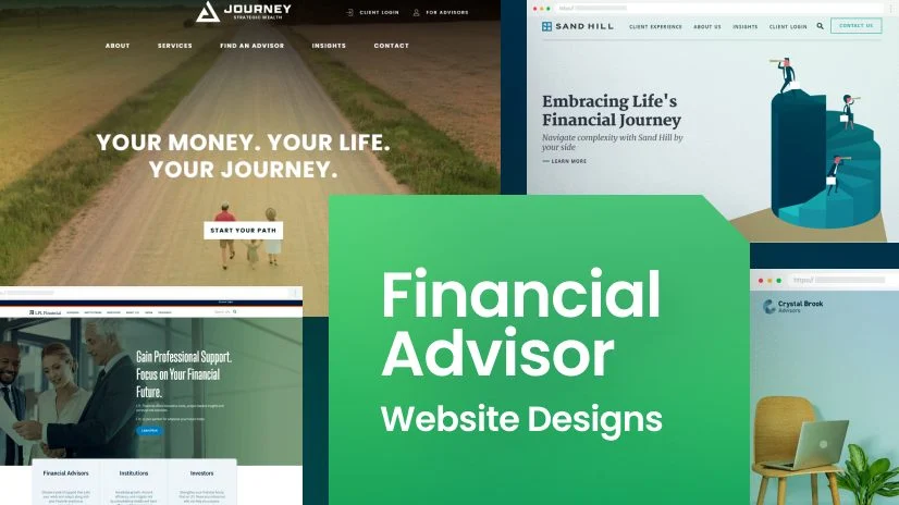
Insurance web design is the craft of planning a website so that a stressed or cautious person can understand your cover, trust your business and ask for a quote without friction. It differs from general business web design because every choice, from colour to form length, has to support trust.
This guide sets out 9 insurance web design principles, explains how to apply them to layout, content and search, and shows how to start from a template instead of a blank screen. It suits agencies, brokers and carriers, and it works whether you build on HTML or WordPress.
Insurance site design covers the structure, visuals, wording and technical setup of a site that sells or explains insurance. The goal is practical: help visitors compare options, feel safe sharing details and take one clear action, such as requesting a quote or calling an agent.
Because insurance is complex and often regulated, good insurance site design also leaves room for compliance details. Licence numbers, privacy policies, cookie notices and clear terms are part of the design, not an afterthought.
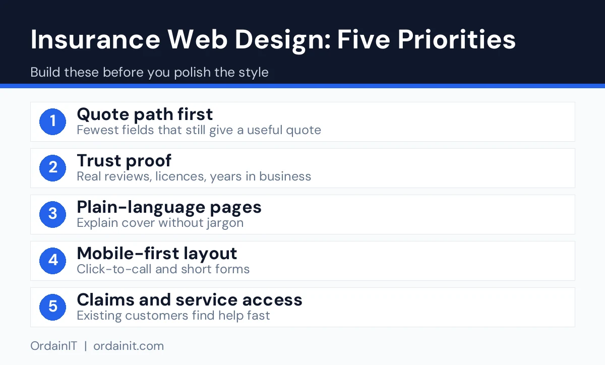
A visitor should know within five seconds what you sell and who it is for. Use direct language such as car, home, health or business cover rather than abstract slogans.
Place proof, such as licences, partner insurers and genuine reviews, near the top of the page. People hesitate to share personal details until they feel the business is real.
Blue and green tones are common in this industry because they feel steady, but your brand colours matter more than any rule. Whatever you choose, keep strong contrast between text and background and leave plenty of white space.
Pick one clear font for headings and one for body text, keep paragraphs short and use a comfortable size on mobile. Policy information is already hard enough to read.
The home page might push a quote, a product page might push a call and a blog post might push a related product. One main button per screen avoids confusion.
Ask only for what you need to start. A name, a contact method and a cover type are enough for a first quote request. Long forms lose people.
Give each type of cover its own page and link them from a simple menu. This helps visitors and gives search engines a clear page for each topic.
Plan the phone layout before the desktop one. Use large buttons, a visible phone number and quick-loading images. Google’s web vitals guidance describes the loading and stability measures worth meeting.
Use proper heading order, descriptive alt text, readable contrast and labels on every form field. This helps people with disabilities and also makes the site easier for everyone to use.
Most successful insurance layouts are built from the same few blocks, arranged to suit the brand.
These blocks also map well to the way people scan a page. They see the promise, check the proof and look for a next step. A template that already contains them saves a large part of the planning.
Design and search work together. Google’s SEO Starter Guide recommends creating helpful content and a clear structure, and that applies directly here. Write one page per product, put the main topic in the page title and heading, and use descriptive file names and alt text for images.
Add a short FAQ to the product pages that matter most. Plain questions such as what is excess or how do I make a claim are searched often, and answering them gives your site more chances to appear for those queries. Always keep your wording accurate and aligned with your carrier and local rules.
A template gives you the layouts above without a long design phase. OrdainIT builds and sells its own templates, so the details below come from the product pages.
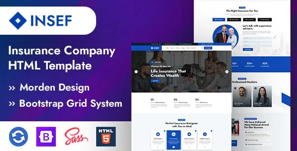
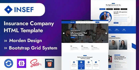
Insef is an insurance HTML template with 3+ home page layouts and 16 HTML pages, built with HTML5, CSS3 and Bootstrap 5, and sold with free lifetime updates. It includes sections for services, portfolio, testimonials and contact.
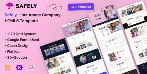
Safely is a free option with 2 home pages and 15 pages in total, including plans, pricing, team, FAQ, blog and a contact page with an AJAX form that needs PHP hosting.
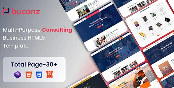
For firms that mix insurance with advice, Buconz offers 6+ home pages and 29+ inner pages for financial and insurance consultants.
To see how other businesses present themselves, read our collection of the best insurance websites, and if you work alone, our guide to the insurance agent website.
The most common problems are easy to fix. Pages that load slowly because of oversized images, forms that ask for too much, missing contact details and text full of unexplained jargon all cost enquiries. Another frequent mistake is mixing every product on one page, which makes the site confusing and hard to rank. Review your site on a phone before you launch, and ask someone outside the industry to find your quote form in under ten seconds.
Launch is the start of the testing phase. Ask five people who are not in the industry to find a quote form and explain what your company sells. Watch where they hesitate, because their confusion points to the parts of the page that need clearer wording.
Then look at real data. Check how many visitors reach the quote form, how many finish it and which pages they leave from. If many people open the form but few submit it, shorten it or move the trust signals closer to it. If product pages get visits but no enquiries, make the main button easier to spot.
Change one thing at a time so you know what worked, and keep notes. Small improvements to a headline, button label or form length often matter more than a full redesign, and they cost far less.
Not every insurance site faces the same design problem. A marketplace and a small-business insurer should not copy each other. This table matches the business type to the design priority, using sites we opened on 14 November 2026.
| Business type | Design priority | Example seen |
|---|---|---|
| Home insurer | Fast start to a quote | Hippo: one free-quote button, three numbered steps, carrier logo strip |
| Small-business insurer | Pick cover by need or profession | Next Insurance: cover cards and a shop-by-profession option |
| Life insurer | Remove fear of the process | Ethos: three-step flow with “no med exam” stated at step one |
| Marketplace or broker | Help the visitor choose a category | Policygenius: Life, Home, Auto, Disability choices plus a phone number |
| Local agent | Personal trust and local proof | Team photos, licence details, Google reviews, click-to-call |
Many insurance design guides skip this part. Treat WCAG 2.1 AA as the target: text contrast of at least 4.5:1 for normal text, visible focus on links and buttons, labels outside form fields, and error messages next to the field they belong to. Show your licence and disclosure details in the footer where your state requires it, and link a plain-language privacy page near every quote form. Test the quote form with a keyboard only and on a small phone before launch.
Insurance site design is the planning and building of a website for an insurance agency, broker or carrier. It focuses on trust, clear explanations of cover and simple routes to a quote or contact.
Good insurance site design is clear, fast and trustworthy. It uses plain language, calm visuals, short forms, trust signals, mobile-first layouts and one clear action on every page.
Blue and green are common because they feel stable and calm, but there is no single rule. Choose colours that match your brand, keep text contrast high and avoid clutter.
Start with a home page, one page per cover type, about and team, contact or quote, FAQ and a blog. You can add more pages as you grow, as long as each one has a clear purpose.
Yes. A template is a quick, lower-cost route and covers the layout needs of most agencies and brokers. Replace the placeholder content with your own text, photos and licence information before launch.
Chosen a theme or template? The OrdainIT team, which designs and builds its own WordPress themes and templates, can also get your website live. Pick a fixed-price service:
Want a design to start from? Browse OrdainIT WordPress themes, each with free installation and lifetime updates, or see all WordPress services. Not sure what you need? Contact OrdainIT for a free, no-obligation quote.
See OrdainIT’s themes and customer ratings on OrdainIT’s ThemeForest profile.