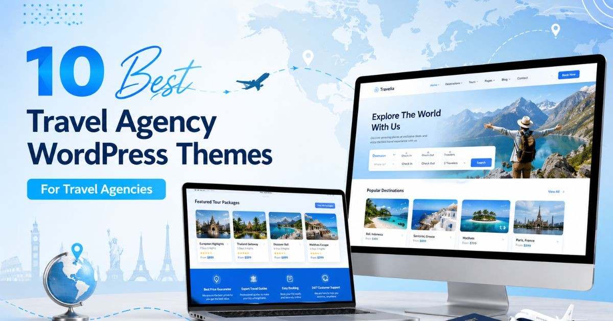
Travel agency website design is the process of planning layouts, content and booking paths so that visitors can go from daydreaming about a trip to sending an enquiry in a few clicks. Good travel agency website design makes tours look appealing, prices clear and the next step obvious, on a phone as much as on a desktop.
This guide covers 8 design principles for travel agency websites, the pages and sections you need, how to present tours and prices, how to build trust, and how to start from a ready-made template instead of designing everything from scratch.
A travel purchase is emotional and expensive. Visitors want to imagine the trip, check that the agency is reliable and understand exactly what they get for the price. Design carries all three jobs. Strong imagery sells the destination, clear structure answers practical questions and visible proof reduces risk.
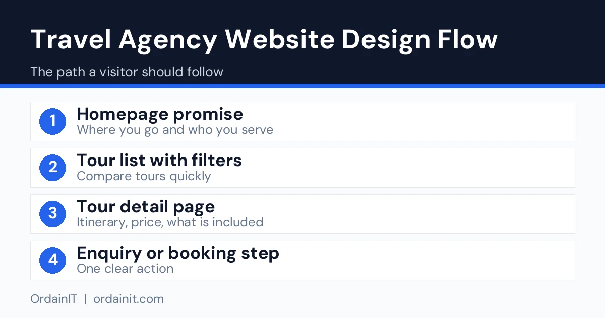
The design also has to be practical for your team. If adding a new tour takes an hour of fiddling, the site will go out of date. Choose layouts that let you repeat the same structure for every trip.
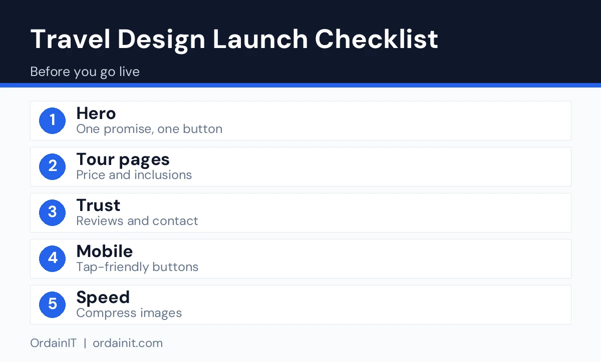
Use a large photo that shows a real destination you sell, with a headline that says what you offer, such as small-group tours or family holidays. Add one main button, for example View Tours or Plan My Trip.
Each tour card should show a photo, a title, the duration, the starting price and one key benefit. Consistent cards let visitors compare quickly.
Show the itinerary, what is included and excluded, group size, difficulty or pace, and the booking or enquiry button. Hidden costs destroy trust, so state them clearly.
A visitor should reach an enquiry form within two clicks from any tour page. Ask only for what you need to respond, such as name, contact details, dates and number of travellers.
Place reviews, partner badges, licences and years in business near the first call to action. Use only genuine reviews you have permission to publish.
Many visitors browse trips on their phones. Use large tap targets, a visible call or message button and compressed images. Google’s web vitals guidance explains the loading and stability measures to aim for.
Group tours by country or region and add short guides to each. These pages help visitors explore and give search engines clear topics to rank.
Choose templates and layouts that you can edit without a developer. A site you can update yourself stays accurate and fresh.
A focused site is better than a sprawling one. Start with these pages.
Travel brands often use blues, greens and warm accents because they suggest water, nature and sunshine, but your own brand colours matter more. Keep strong contrast between text and background so content stays readable on bright phone screens.
Photography is the heart of the design. Use your own photos or properly licensed images, keep a consistent style and compress every file. Pick one heading font and one body font, and keep paragraphs short. A clean look with space around the images usually converts better than a busy layout with many effects.
A template gives you tested layouts so you can focus on your tours. Travello is OrdainIT’s tour website template with 5+ home pages and 28+ valid HTML5 pages, built with HTML5, CSS3 and Bootstrap 5.x. It includes layouts for tour packages, itineraries and bookings, integrated Google Maps, a fixed menu and free lifetime updates. It suits travel agencies, tour operators, hotels, vacation rentals and cruise or adventure companies.

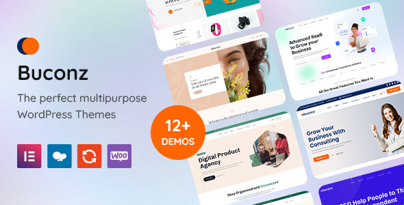
If you prefer WordPress, the Buconz multipurpose theme offers 12 homepages, Elementor and WPBakery versions and one-click demo import. It is not travel-specific, so you would build your own tour layouts with the page builder.

The photos in the Travello preview are for demonstration only and are not included in the download, so replace them with your own pictures.
Design and search work together. Give each tour and destination its own page with a clear title and heading, write original descriptions and add descriptive alt text to images. Google’s SEO Starter Guide explains how structure and helpful content support visibility. Add a short FAQ to important pages covering visas, payment, cancellation and what to pack, since these are common questions.
Related guides: travel agency website template, travel agency WordPress theme and travel agent website.
Price is the first thing many visitors look for, so show it early and honestly. Display a starting price on each tour card and explain on the tour page what it covers: flights or not, accommodation, meals, transfers, entry fees and guide costs. List exclusions too, such as visas or travel insurance. Visitors trust agencies that are open about costs, and clear pages reduce time-wasting enquiries.
For itineraries, use a day-by-day layout with a short heading and two or three lines per day. Add a map or route overview so people can see the journey at a glance. Include practical details such as group size, pace and accommodation style. If dates vary, show a simple availability list or ask visitors to enquire for dates.
Keep this structure identical across all tours. When every page follows the same layout, visitors learn it quickly, your team can add trips faster and search engines can understand each page more easily.
The most common mistake is filling the home page with sliders, pop-ups and offers, which slows the site and hides the main action. Another is using stock photos that do not match the real tours, which breaks trust when visitors see the difference. A third is hiding the phone number or enquiry button on mobile.
Also avoid copying supplier descriptions word for word, because duplicate text rarely ranks and does not stand out. Check every page on a real phone, test forms regularly and update seasonal offers so old promotions do not stay online. Small fixes like these often lift enquiries more than a full redesign.
| Area | What to do | Why it matters |
|---|---|---|
| Homepage | One clear promise, search or enquiry box, one main button | Visitors decide within seconds whether you look credible |
| Trust | Real team photos, reviews, licences or memberships, phone and WhatsApp | Travel is a high-value purchase and buyers look for proof |
| Tour pages | Price, dates, inclusions, exclusions, itinerary, FAQ | Answers the questions that stop a booking |
| Photos | Real trips and accommodation, not only stock images | Shows what the traveller will actually get |
| Booking or enquiry | Short form, visible deposit or cancellation terms | Reduces drop-off and surprises |
| Mobile and speed | Compressed images, tap-friendly buttons | Many visitors arrive from social links on phones |
| Accessibility | Contrast, alt text, labelled form fields | Helps every visitor and reduces risk |
Design is not only decoration. It should remove doubt about price, safety and what happens after the visitor clicks.
Travel agency website design is the planning of layouts, content and booking paths for a travel business site. It aims to make tours attractive, information clear and enquiries easy.
Start with a home page, tours, tour detail pages, destinations, about, contact and a blog or guide section. Add a privacy policy and terms of booking.
Show clear prices and inclusions, add genuine reviews, keep the enquiry form short and make sure the site works well on a phone.
Yes, for most agencies. A template gives you tested layouts and saves time. Replace the sample content with your own tours, photos and details.
Blue, green and warm accent colours are common, but your brand matters more. Keep text contrast high and let photos lead.
Chosen a theme or template? The OrdainIT team, which designs and builds its own WordPress themes and templates, can also get your website live. Pick a fixed-price service:
Want a design to start from? Browse OrdainIT WordPress themes, each with free installation and lifetime updates, or see all WordPress services. Not sure what you need? Contact OrdainIT for a free, no-obligation quote.
See OrdainIT’s themes and customer ratings on OrdainIT’s ThemeForest profile.





 New release: