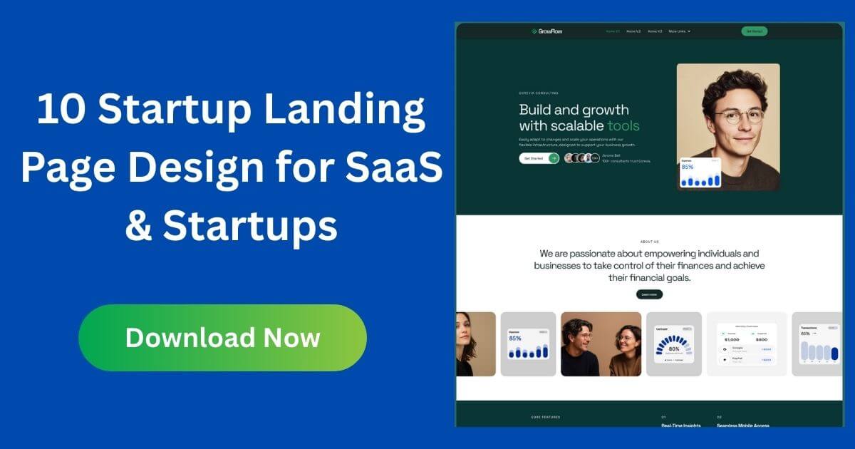
A startup landing page is a single focused page that explains a new product and asks visitors to take one action, such as joining a waitlist, starting a trial or booking a demo. What belongs on it depends on your stage: a pre-launch page tests interest, an MVP page wins first users, and a growth page converts paid traffic. This guide gives you the structure for each stage, a section-by-section checklist, the tools to build it, and the mistakes that stop sign-ups.
A website has many pages and serves many visitors: customers, investors, job seekers and press. A landing page serves one audience and one goal, with navigation kept to a minimum so visitors are not distracted. Early startups often launch with a landing page first, then grow it into a full site once the product and message settle.
The goal is learning, so track sign-up rate by traffic source and talk to people who join.
| Section | Pre-launch | MVP | Growth |
|---|---|---|---|
| Headline | Problem and promise | Outcome and audience | Matches the ad |
| Proof | Founder experience | Beta users, real screenshots | Logos, case results, ratings |
| Call to action | Join waitlist | Start free / request access | Trial, demo or buy |
| Form | Email only | Email + optional role | As short as sales allows |
| Pricing | Not needed | Simple or “free during beta” | Full plans or contact sales |
| Measure | Sign-up rate by source | Activation of new users | Conversion rate and cost per sign-up |
We earn nothing from third-party tool mentions.
A useful headline pattern is outcome plus audience plus method, kept under about twelve words. For example, an invoicing tool might say “Get paid faster: invoices for freelancers that remind clients for you”. Avoid vague words such as revolutionary, seamless or next-generation, which tell visitors nothing. Under the headline, add one sentence that removes the biggest doubt, such as setup time, price or who it is not for. Test your headline by showing the page to someone outside the company for five seconds and asking what the product does; if they cannot answer, rewrite it.
New startups rarely have logos or case studies, but proof can still be honest and specific. Show the product working with real screenshots or a short screen recording. Explain the founders’ relevant experience in one or two sentences. Share a number you can stand behind, such as people on the waitlist or pilots running, with a date. Quote beta users only with their permission and real names or roles. Never invent testimonials or use logos of companies that are not customers; it can damage trust and may break advertising and consumer protection rules.
Most startup traffic now arrives on phones, especially from social posts and ads. Design the mobile version first: the headline, one supporting line and the button should be visible without scrolling. Keep the form to one field where possible, use large tap targets, and make sure the page loads quickly on a slow connection by compressing images and avoiding autoplay video. Check the page on a real phone, not only in a desktop browser preview.
Collecting email addresses means handling personal data. Add a short line under the form saying what you will send and how often, link to a privacy policy, and use double opt-in if you are emailing people in regions that expect it. Make unsubscribing easy. Clear expectations also improve the quality of your list, because the people who join actually want to hear from you.
A startup landing page only works if people see it. Share it where your audience already spends time: relevant communities, newsletters, founder networks and your own social accounts. Write a short launch post that explains why you are building the product, not just what it is. If you run ads, send each campaign to a page whose headline matches the ad. Reply personally to early sign-ups and ask one question about their problem; those answers often improve the page more than any design change.
Add simple analytics before launch and define one main event, such as waitlist sign-up or trial start. Look at the conversion rate by traffic source rather than in total, because visitors from a niche community behave very differently from paid traffic. Change one thing at a time, keep a short log of what you changed and when, and wait for enough visits before judging. Headline and call-to-action changes usually move results more than colour or layout changes.
Once visitors start asking about pricing, team, careers or integrations, it is time to grow the page into a full website. Our startup website template guide compares options by format.
A single page that explains a new product and asks visitors to take one action, such as joining a waitlist or starting a trial.
A clear problem and promise, a short explanation, an email-only waitlist form and an expected launch window.
Long enough to answer the questions that stop a visitor from acting. Simple, cheap products need less; complex or expensive ones need more proof and FAQ.
Keep it minimal. A logo and one button are often enough; remove links that lead away from the goal.
Track the share of visitors who complete the main action, by traffic source, and test one change at a time.
Chosen a theme or template? The OrdainIT team, which designs and builds its own WordPress themes and templates, can also get your website live. Pick a fixed-price service:
Want a design to start from? Browse OrdainIT HTML templates, with lifetime updates, or see all WordPress services. Not sure what you need? Contact OrdainIT for a free, no-obligation quote.
See OrdainIT’s themes and customer ratings on OrdainIT’s ThemeForest profile.




 New release: